

Table of contents
- Universal Selector:
- Individual Selector:
- Class & ID Selector:
- ID Selectors:
- Chained selector:
- Combined selector or selector list:
- Inside an element or Decendent Combinator:
- Direct child or Child Combinator:
- Sibling + or Adjacent Sibling Combinator:
- Sibling ~ or General Sibling Combinator:
- Pseudo Classes(:) & Elements(::)
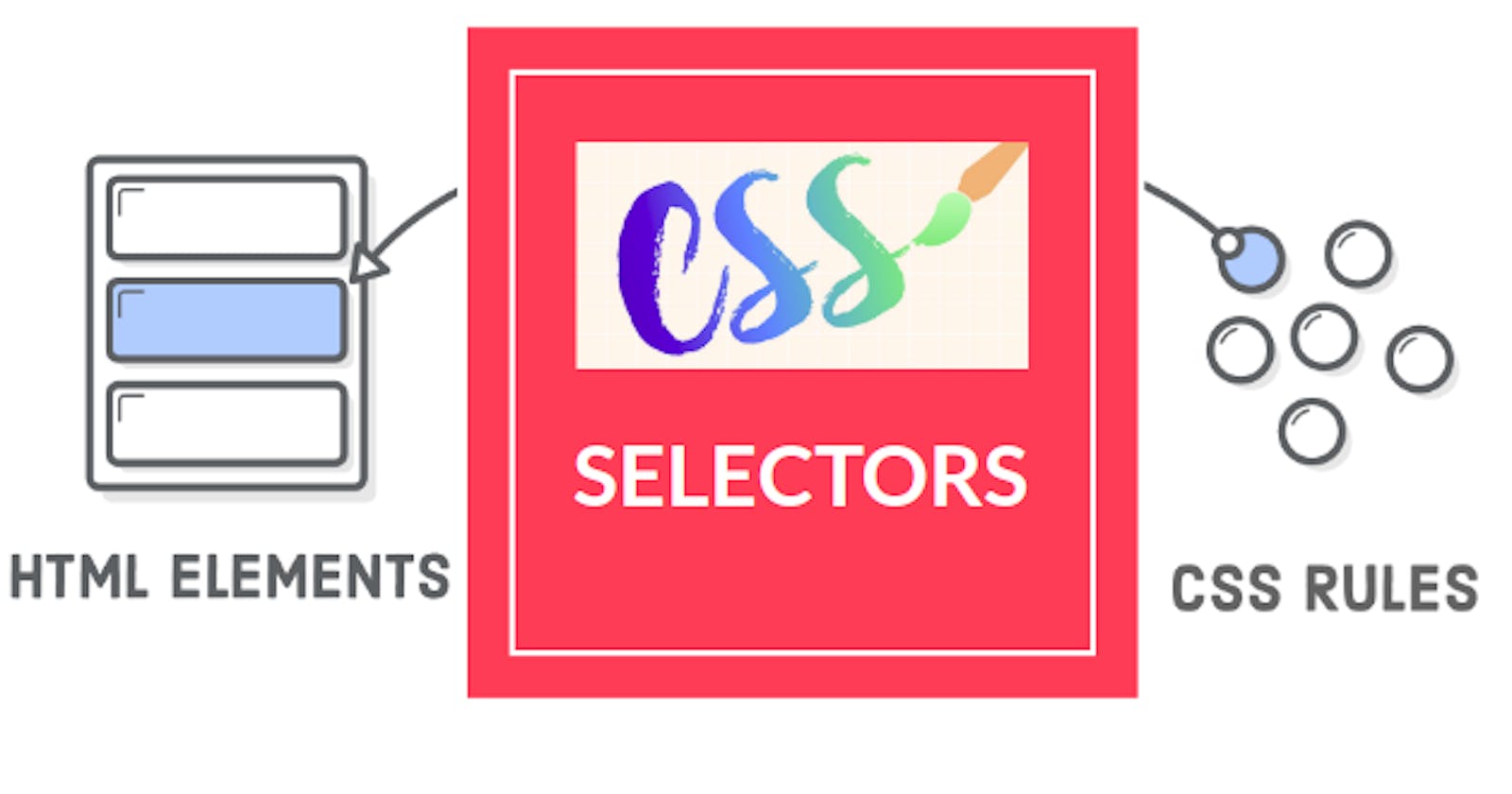
In the CSS, selectors played a vital role. It targets the HTML element, class & Ids. There is a wide variety of selectors available & we can get an accurate output with the help of these selectors. We'll look into the different types of selectors as follows.
Universal Selector:
As per the name of the universal selector, it comes starting of the CSS sheet. It indicates by an asterisk (*) & under this universal selector input like padding and margin removes instead of by default styling added by the browser, everything close together.
Syntax:
* { style properties }
Example:
/* Universal selector */

        * {
            background-color: #E5D68A;
            color:  #758283;
            padding: 2;
        }
In CSS we can see a thing for background color and color we pass a hexadecimal code of 6 digits. We also can use names like blue, red, white, and black but all browsers can render the same color it differs slightly. So for maintaining the standardization purpose we use hexadecimal coded colors. We can pick color from here.
Individual Selector:
In this selector, we can target the HTML element like p, div, span, ul, li, em, section, etc. We can directly target the tags and assign different properties to them. But the specificity is less in this selector.
Syntax:
element { style properties }
Example:
/* Individual selector */
    p {
       background-color: #242B2E;
    }
Class & ID Selector:
Give a class name for the desired element and all elements that have the same class name will be styled. It matches the elements based on their class name. We can have multiple classes in any code file. Class name always starts with a . (dot).
Syntax:
class_name {style properties}
Example:
/* class selector */
 .keyword1{
           background-color: #1C8D73;
 }
ID Selectors:
In the ID selectors match elements based on the value of the element's id. ID is more specific & precise for assigning the properties. And it has a unique identity in any code. Here we use # (hash) before selecting any id.
Syntax:
#id_value { style properties }
Example:
/* ID selector */
#keyword1{
          background-color: #1C8D73;
          color: #383CC1;
 }
Chained selector:
We can select at least two classes with the help of ( . ) & assign the property. No need the additional space in this selector.
Syntax:
classname1.classname2 { style properties }
Example:
/* Chained selector */
.warning.text-black {
                     background-color: burrlywood;
                     color: black;
    }
Combined selector or selector list:
It combines 2 elements with the same styling and is separated by " , "(comma).
Syntax:
element 1, element2, element,...{style properties}
Example:
COPY
/*Combined Selector */
p, h1, span {
             background-color: #F4BE2C;
}
Inside an element or Decendent Combinator:
As per the selector's name, its styling is selected on the decedent value using their element names and separated spaces. Where from - parent-child - grandchild - great-grandchild. It needs to be in the name sequence only for working.
Syntax:
selector1 selector2 { style properties }
Example:
/* Inside an element or Descendent combinator  */
div ul li {
           list-style-type: circle;
}
Direct child or Child Combinator:
In the direct child, elements are separated by " > " which defines its hierarchy. As per the syntax, the sequence should be element1 is the parent1, element2 is the child, and element is the grandchild.
Syntax:
element1 > element2 > element { style properties }
Example:
/* Direct child or child combinator  */
div > ul > li {
               background-color: #1C8D73;
 }
Sibling + or Adjacent Sibling Combinator:
In the adjacent sibling combinator, the styling is applicable on the second element only, if there will be paragraph-p after unordered list-ul then element 2 (p) styling will be applied. Two elements are separated by ' + '. The sequence should be maintained & it applies to the next immediate one. Both are children of the same parent.
Syntax:
element1 + element2 { style properties }
Example:
/* Sibling + or Adjacent Sibiling Combinator */
ul + p {
        background-color: #F4BE2C;
}
Sibling ~ or General Sibling Combinator:
It also works similarly to adjacent siblings except we use ~. Element 2 can come after subsequent children.
Syntax:
element1 ~ element2 { style properties }
Example:
/* Sibling + or General sibling combinator */
p ~ span {
          color: red;
}
Pseudo Classes(:) & Elements(::)
::before
It is usually to add content before any element. It's often used to add cosmetic content to an element with the content property.
Syntax:
Element1: element2: …::before{ style properties }
Example:
/* Pseudo classes - Before  */
        span::before{
            content: "Test ";
        }
::after
After the element style properties will be added. Here it's after the p tag.
Syntax:
Element1: element2: …::after{ style properties }
Example:
/* Pseudo classes - After  */
        p::after{
            background-color: burlywood;
            content: "Hotstar";
            color: #FF6666;
        }
:hover
When we hover over an element we will see some styling properties being applied.
Syntax:
Element1:hover { style properties }
Example:
 /* Pseudo classes - Hover  */
        h1:hover{
            background-color: #E5D68A;
            color: #758283;
        }
:Visited
This pseudo-class applies once the link has been visited by the user. For privacy reason, the modified style is also limited. This class applies only to attributes. For the styling, purpose put the " :visited " rule after " :link " but before " :hover " and " :active " rules by LVHA-order (link-visited-hover-active).
Syntax:
element:visited { style Properties }
Example:
a:visited {
    color: #F4BE2C;
    text-decoration-color: #1C8D73;
}
:focus
As per the name this class make an element in focus. In the form when the user clicked on the tab, that particular tab is highlighted for filling in the information purpose.
Syntax:
element:focus { style properties }
Example:
input:focus {
    background-color: #F4BE2C;
    color: #758283;
}