

Table of contents
- Basics and Terminology
- Main Axis
- Main-start|Main-end
- Cross-start | Cross-end
- Cross size
- Flexbox Elements
- Every property can apply to the container and the specific items (children). For that, we need to assign the property according to our usage.
- Justify-content(Parent properties):
- Align Items:
- flex-direction:
- flex-wrap:
- Children Properties:
- CSS games for practice:
Flexbox is a layout model that enables Dynamic & Efficient element arrangment. The one dimensional layout allows elements to be placed inside a container with evenly distributed space.
The flexible box module, usually refer as a Flexbox. It helps to design a responsive website for different gadgets & sreen-resolution. There are major four layout modes:
Block:
Used for section in a webpageInline:
Used for TextTable:
Used for two-dimentional dataPositioned
Used for explict position for an element
Basics and Terminology
Flexbox is an entire module rather than single property, it involves several different things in addition to its entire properties. Some of them are meant to be set on the container (parent element, known as “flex container”) whereas the others are meant to be set on the children (said “flex items”).
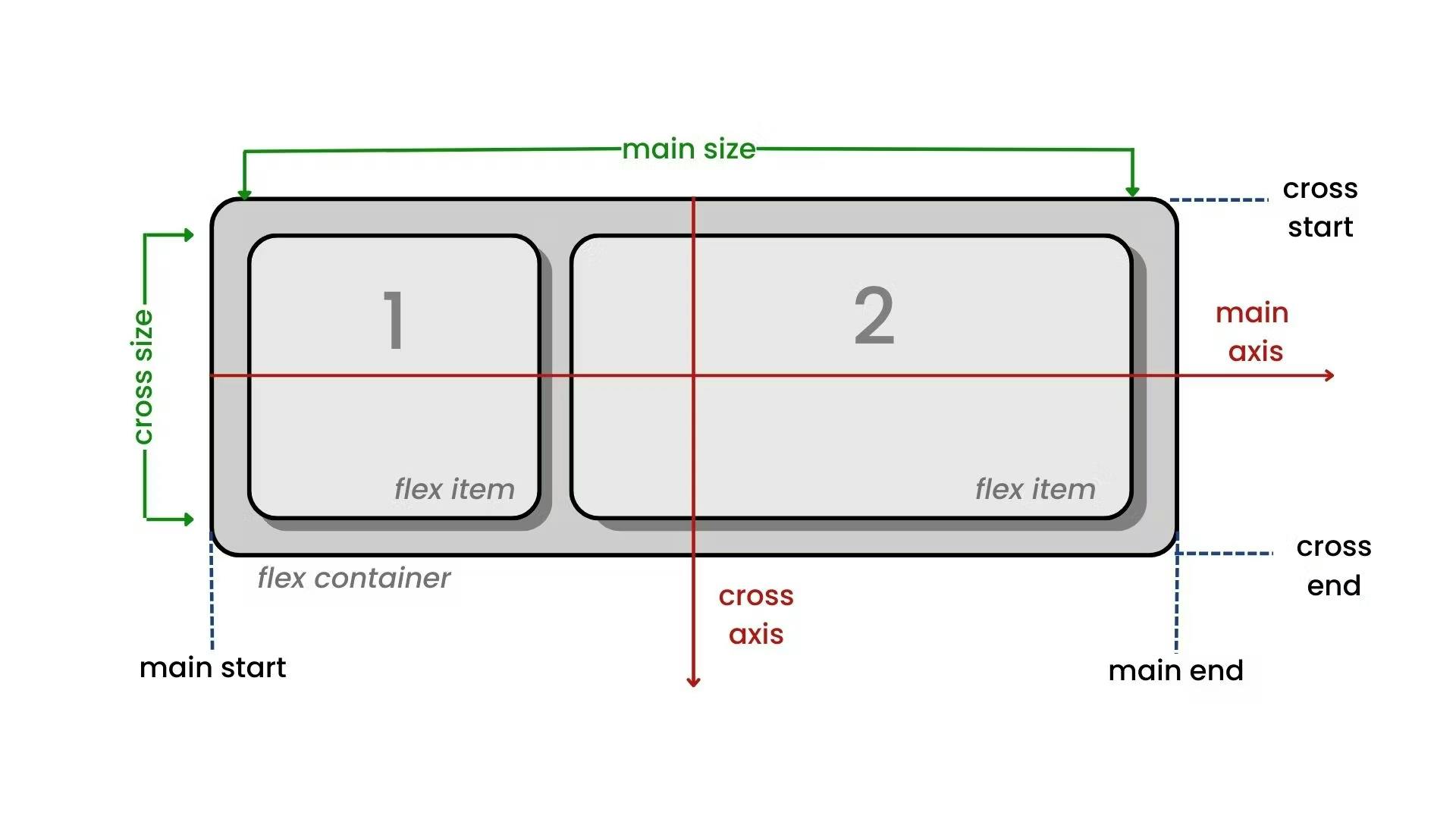
Items will be laid out of following either the main axis (from main-start to main-end) or the cross axis (from cross-start to cross-end).
Main Axis
The main axis of a flex container is the primary axis along which flex items are laid out. Beware, it is not necessarily horizontal, it depends in the flex direction property.
Main-start|Main-end
The flex items are placed within the container starting from main-start and going to main-end.
Cross-start | Cross-end
Flex lines are filled with items and placed into the container starting on the cross-start side of the flex container and going toward the cross-end side.
Cross size
The axis perpendicular to the main axis is called the cross axis. Its direction depends on the main axis direction.
Flexbox Elements
For the Flexbox model, first we need to define the container.
    <div class="container">
      <div>1</div>
      <div>2</div>
      <div>3</div>
    </div>
Every property can apply to the container and the specific items (children). For that, we need to assign the property according to our usage.
Justify-content(Parent properties):
The Justify-content property is used to align the flex items along the main axis of the flex container. for that display should be flex first.
.container{
    display:flex;
    justify-content:flex-start/flex-end/center/space-between/space-evenly/space-around;
 }
Flex-start(default) : It aligns the flex items at the start of the container along the main axis.
flex-end: It aligns the flex items at the end of the container along the main axis.
center: It aligns the flex items center within the container along the main axis.(Prolly the most used property).
space-between: It distributes the flex items along the main axis, with the first item at the start of the container and the last item at the end of the container.
space-around: It distributes the flex items along the main axis, with equal space between each item.
space-evenly: It evenly distributes the flex items along the main axis with equal space between each item and the start and end of the container.

Align Items:
Align-items property is used to align flex items along the corss-axis of the flex container. It's simply perpendicular to main-axis.
.container{
    display:flex;
    align-items:flex-start/flex-end/center/baseline;
 }
Stretch(default) : It stretches the flex items to fill the container along the cross-axis.
flex-start: It aligns the flex items at the start of the container along the cross-axis.
flex-end: It aligns the flex items at the end of the container along the cross-axis.
center: It centers the flex items within the container along the cross-axis.

flex-direction:
Flex-direction defines the main-axis along which flex items are laid in a flex container.
.container{
    display:flex;
    flex-direction:row/row-reverse/column/column-reverse;
 }
Row(default) : Flex items are laid out horizontally from left to right, with the first item at the start of the main axis and the last item at the end.
row-reverse: Flex items are laid out horizontally from right to left, with the first item at the end of the main axis and the last item at the start.
column: Flex items are laid out vertically from top to bottom, with the first item at the start of the main axis and the last item at the end.
column-reverse: Flex items are laid out vertically from bottom to top, with the first item at the end of the main axis and the last item at the start.

flex-wrap:
In flex-wrap, it determines whether flex items should wrap or not if they exceed the width of the container.
.container{
    display:flex;
    flex-wrap: no-wrap/wrap/wrap-reverse;
 }
No-wrap(default) : It means that the flex items will not wrap, and will instead overflow the container if the width is exceeded.
wrap: This value allows the flex items to wrap ifinto different lines. This property is used to avoid overflow.
wrap-reverse: This value is similar towrap, but the order of the flex items are going to be reversed.
Children Properties:
flex-grow: It specifies how much the flex item should grow relative to the other flex items when there is extra space along the main axis.
flex-shrink: It specifies how much the flex item should shrink relative to the other flex items when there is not enough space along the main axis.
flex-basis: It specifies the initial size of the flex item before any growing or shrinking occurs.
order: It specifies the order in which the flex item should appear within the container. By default flex items have an order of 0.
align-self: It specifies how the flex item should be aligned along the cross-axis. It has the same properties of align-items such asflex-start,flex-end¢er.
CSS games for practice:
In CSS, you can't be the master, it's all about the practice. The more you practice the more you will become good at CSS. There are several games out there to enhance beginner's skills. I will suggest you certain games for practice..